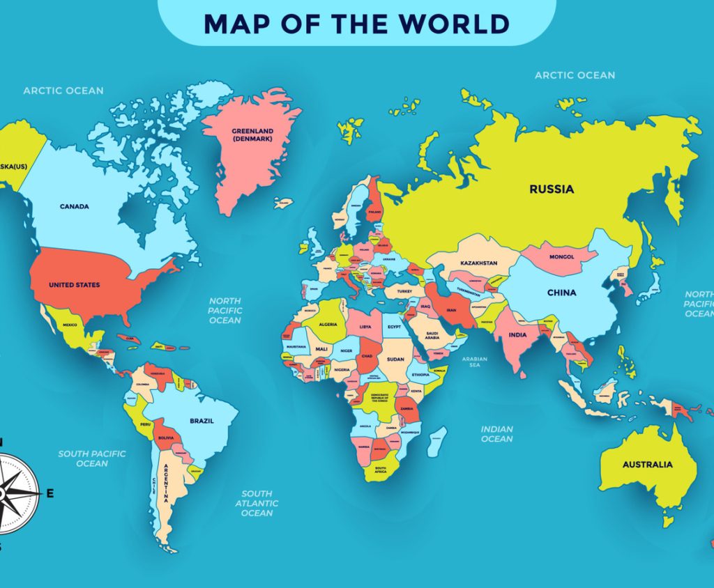
A lot ask Is the “world map” a big lie that has been going on for 500 years?
The current world map, known as the Mercator Map of 1569, is one of the most persistent hoaxes in geographic history, persisting for over 500 years. Designed primarily for navigation, the map significantly distorts the size of continents, depicting Greenland as roughly the size of Africa, when in fact, Africa is 14 times larger. The distortion extends to the point that the United States, China, India, and Japan could all be placed inside Africa, and there would still be room.
The distortion in the representation of areas on the Mercator map stems from its design, which preserves angles but expands and magnifies areas the further away from the equator you move. For example, at 60° latitude, the map’s dimensions quadruple, while at 75° latitude, the ratio increases by a factor of 15. These distortions became widespread during the era of European colonialism, as they visually justified dominance and power, making European empires appear larger and more significant compared to the colonized territories in Africa and South America.
In light of this, the African Union described the map as part of “the longest-running disinformation campaign in history” and is currently leading a campaign called “Correct the Map” to adopt more accurate maps such as the “Equal Earth” maps developed in 2018, which more accurately depict the world in its true size
